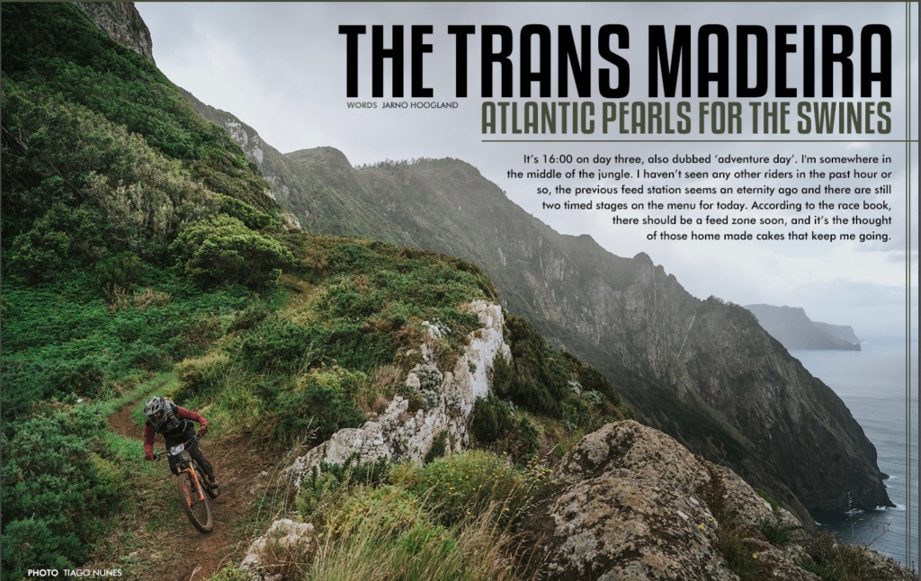
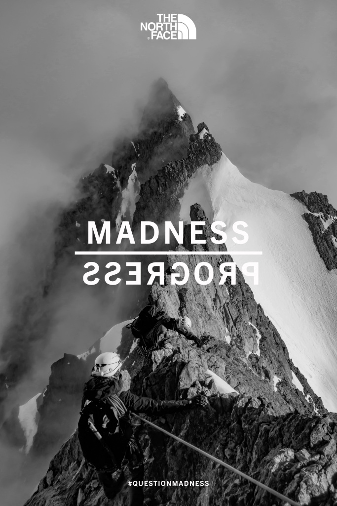
The North Face has been creating quality products and content since the beginning. Not only have the been constantly innovating the outerwear industry but also pushing the limits of the outdoors. I found this ad and thought it was quite spectacular. I really enjoyed the black and white design of the large mountain peak. The biggest thing that stood out to me was the “madness” reflecting to “progress” which made me want to recreate this ad.

https://cargocollective.com/grantmiller/THE-NORTH-FACE-Question-Madness
The image was found in a collection of The North Face Question Madness campaign book. The campaign highlights The North Face’s history through the extreme adventures and innovative designs.
Original Ad Analysis
Design

There may be a lot going on in the draw overs but the design of the ad is quite simple. Climbing to the top of a peak is anything but simple but I like how simple this ad is. The red line emphasizes the contrast in the design. The left side of the mountain is shaded and almost completely dark, contrasting the right side which is very white and light. The mountain is aligned in the middle of the ad with all 3 titles (The North Face, Madness/Progress, and #questionmadness). Everything is also very spaced out. All of the titles are equally spaced out in the middle of the image. While the climber is in the bottom right of the image.
Color

Going with the simplicity of the design, the ad is completely in black and white. I really like how the ad is in black and white because it makes the mountain peak really stick out. I think it also gives it an older looking vibe which fits quite well with their campaign. The black and white color adds a lot of contrast between the mountain itself, the dark sky, and the climber. The text stays white which keeps it simple. I’m impressed that the white text doesn’t get too lost with the white mountain peak behind it.
Typography
I do not have very many comments on the typography of this ad. From what it looks like the designer decided to use the same San Serif that is used in almost every single North Face logo. The cool thing about the ad is the “Madness” & “Progress”. I like how the progress is reflected across the line showing that madness brings progress. Even the hashtag is the same type as the logo and the main Madness/Progress.
New Ad Analysis

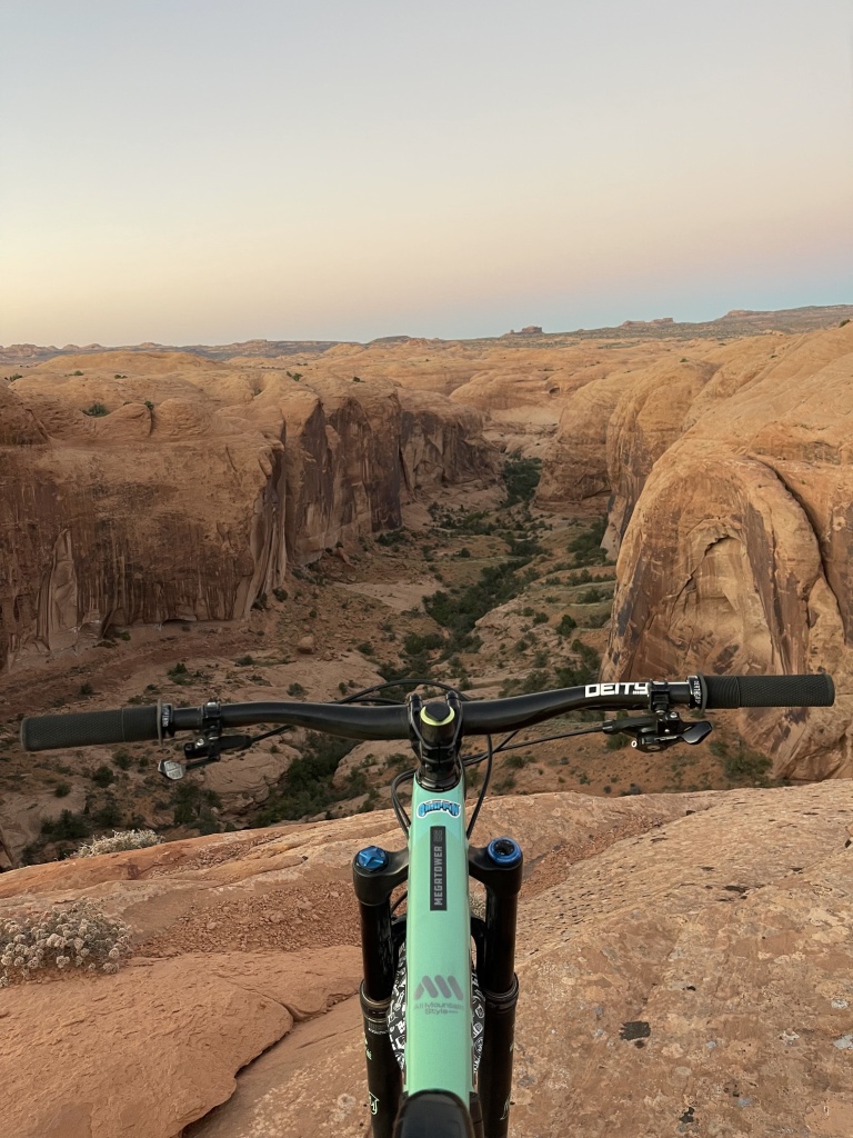
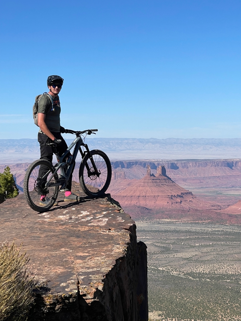
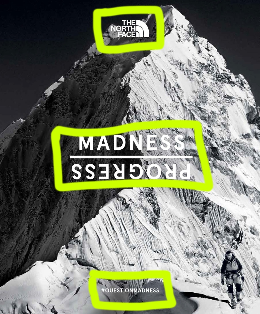
The first ad was very cool and successful, so I wanted to make sure I kept the design elements as similar as possible. The alignment is still the peak going basically in the middle of the ad. The text and logo still fall directly in the center of the ad. The mountain still contrasts the fog and the sky. I kept the proximity of the logo and texts basically the exact same. The proximity is slightly different and closer because there are two climbers in the image I used. The biggest element is the contrast between the grey mountain and the white snow.
Color

Just like the original ad I kept the black and white color scheme. The black and white color scheme creates a really good contrasting effect. It also makes an older effect to which helps the campaign of the Question Madness. The text color was also kept white to keep with the black and white color scheme.
Typography

My main goal with the typography was to find a type that was as close as possible to The North Face logo type. I used Trade Gothic Next LT Pro which is a San Serif that was the closest I could find. I used the same text for the hashtag at the bottom. With the text I used a white font to keep with the same black and white color scheme.
Conclusion
Recreating the original ad has been a fun experience. I think that I recreated the ad very well. It’s so similar that I think that in the future I would change the ad a bit differently. The North Face is an impressive brand to me from their products to their content they create. Over the years they have questioned madness and created progress in the outdoor industry.