By Braden Smith
International Mountain Bike Magazine provides the world with free mountain bike content. IMB is the most successful free bike magazine as it has readers in over 150 countries. Every two months IMB publishes a completely free to read magazine that covers all things mountain bikes. Their content covers bike news, bike reviews, interviews, techniques, travel, and much more from all around the world. Since 2009 they have published hundreds of features tactically using typography and photography.
Category Identification

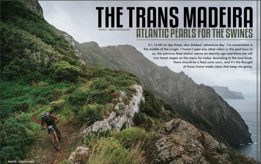
The article uses two different types in the image. The title (outlined in blue) is a bolded type that grabs your attention. This type would be a slab san serif. The body of the caption on the photo (outlined in green) is more of a modern san serif. These different types are quite similar and help unify the entire typography on the magazine spread.
Typography Contrast
The magazine spread doesn’t have a whole lot of typography contrast but enough to discuss. The largest contrast in typography is the difference in size between the heading and the body of the article. The best looking contrast in my opinion is the different colors of type from the heading (outlined in blue) and the subheading (outlined in orange). I think the contrasting color sets a stage for an emphasis on the “Atlantic Pearls For The Swines”. The color of the subheading (outlined in orange) is very aesthetically pleasing as the color matches the color of the mountain background.
Photography

What makes this photo so impressive? First off the location of the photoshoot is absolutely stunning. The photo is a great example of the rule of thirds as the subject (the biker) is on the left 1/3 of the photo. The photographer also used emphasis heavily to allow the rider to stand out in such a unique landscape. Other honorable mentions are movement. The eyes move from the rider to the Ridgeline and follow the Ridgeline.
Alternate Images For Emphasis

Summary
International Mountain Bike Magazine was able to create a beautiful spread showcasing mountain biking. Their article is a good example of how to use typography and photography together. I think their could be a bit more contrast and different types in their magazine spread but it does look very clean. Using clean typography and photography come together beautifully in their publication.
